Designing a growth system for user activation & conversion
Through a new user-state framework and redesigned interface, I reframed Xfinity Home Security from "feature-first" to "user-first," guiding customers from awareness to engagement, and improving feature activation by 12% in the first month.
Reframed the initial ask
Instead of simply re-organizing a cluttered tab, I focused on the actual goal, moving customers through activation states.
Mapped a user-state framework
I defined the states & journey that users would experience across features, devices, and subscription levels.
Redesigned the interface
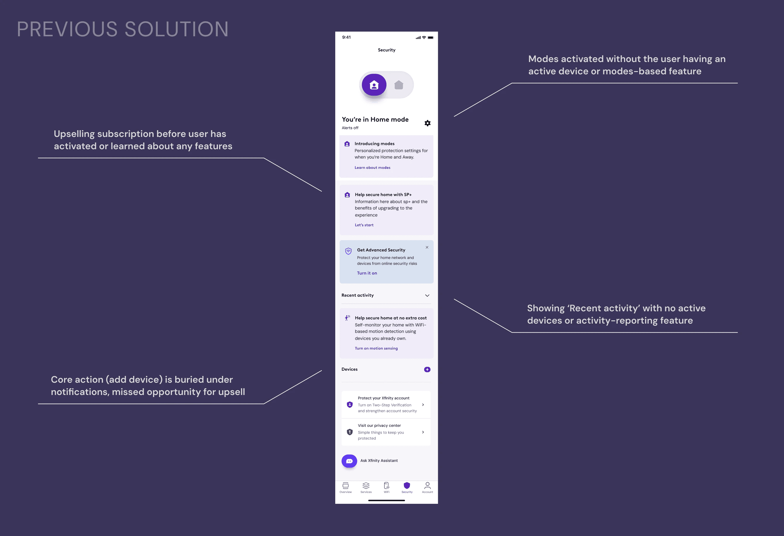
I translated the framework into the UI, redesigning empty states & standardizing page hierarchy around progression.
A built-in audience, barely tapped
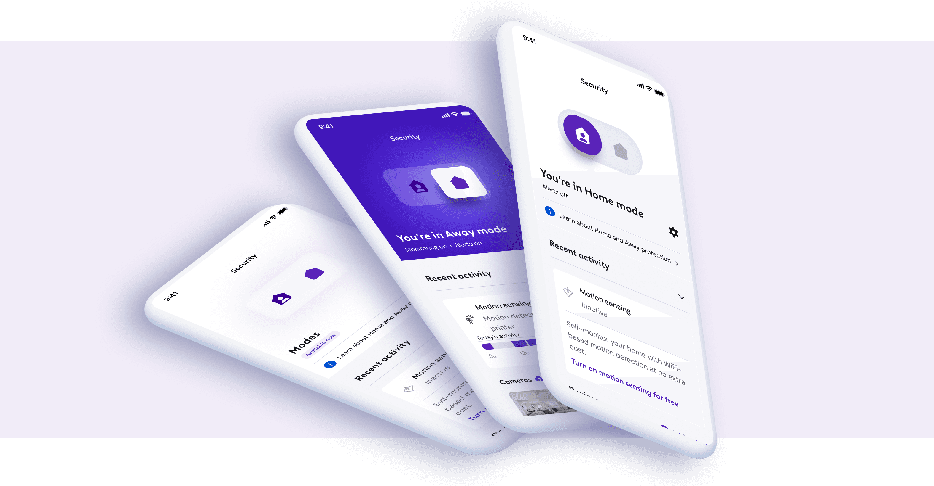
Xfinity Home reached tens of millions through internet service, and most were already active in the app. Almost none had crossed into Home Security. The audience was there, waiting for a reason to engage.
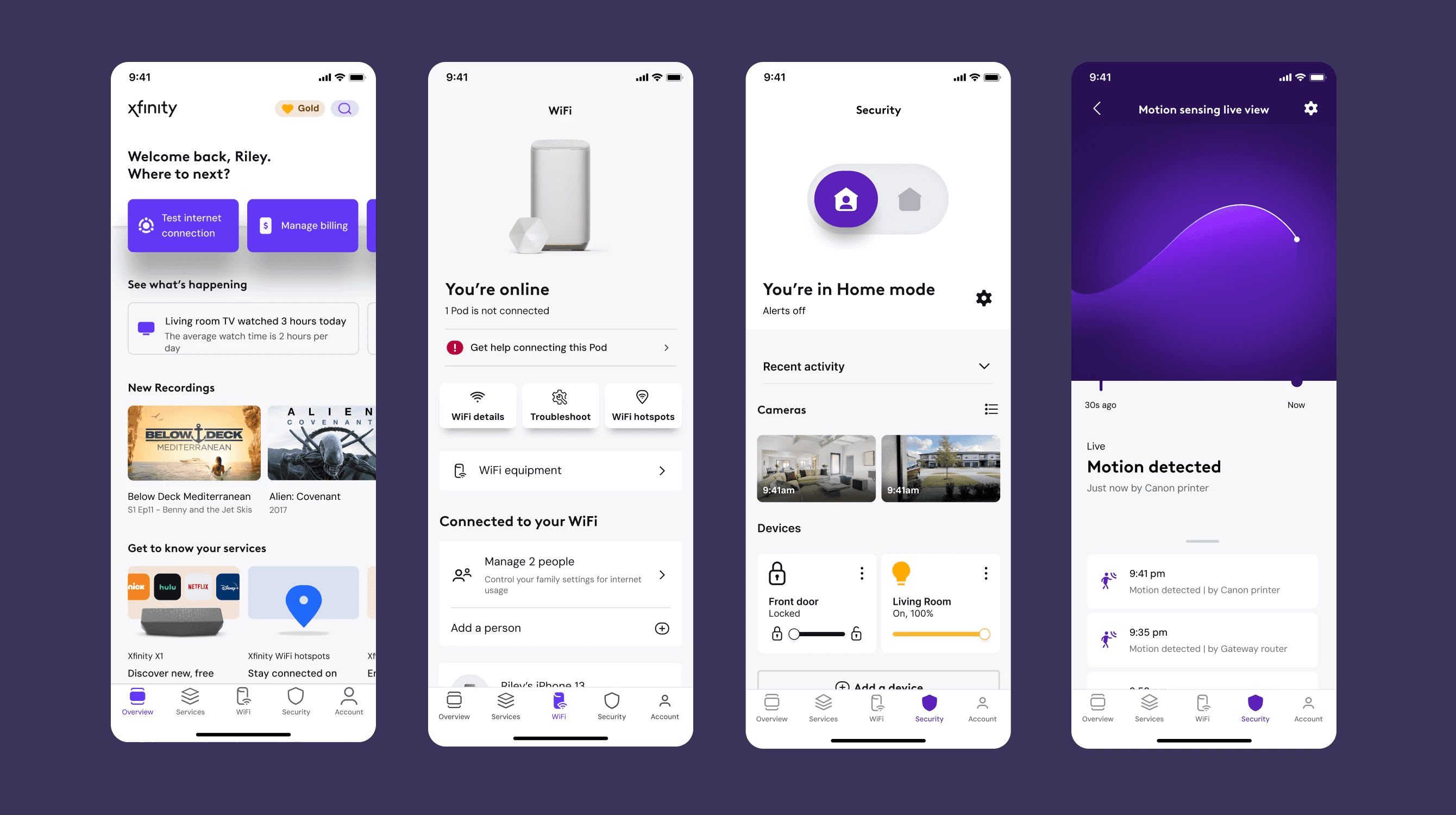
The business goal was progression but the product treated users and screens as static entities. Our CTAs weren't contextual to where the user was, or where we wanted them to be.
To solve this challenge I described & documented how a user can progress through security features, as they add devices, activate features, or subscribe to Plus services, going from zero to power user.
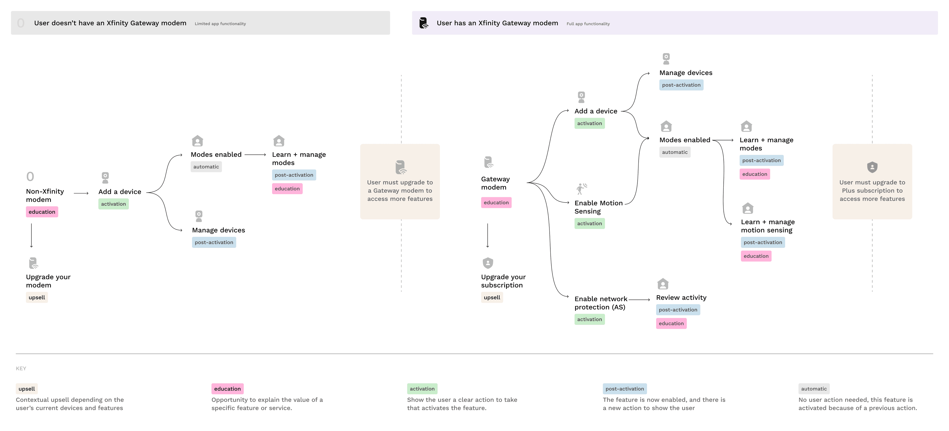
Customers who knew Xfinity only as their internet provider needed to discover that security product existed and understand why it would matter to them.
Customers who had crossed into the security product but hadn't yet activated the new free or paid features needed clear next steps, not more marketing.
Customers who were already using the system day-to-day needed the marketing to get out of their way to access their security features, devices, and tools.
Empty states became the engine
First-time users received education on features they are missing out on, and interacted with familiar UI patterns that pointed at a clear next step (get a new device, activate the free feature, or learn about the services, etc) that moved them towards subscription.
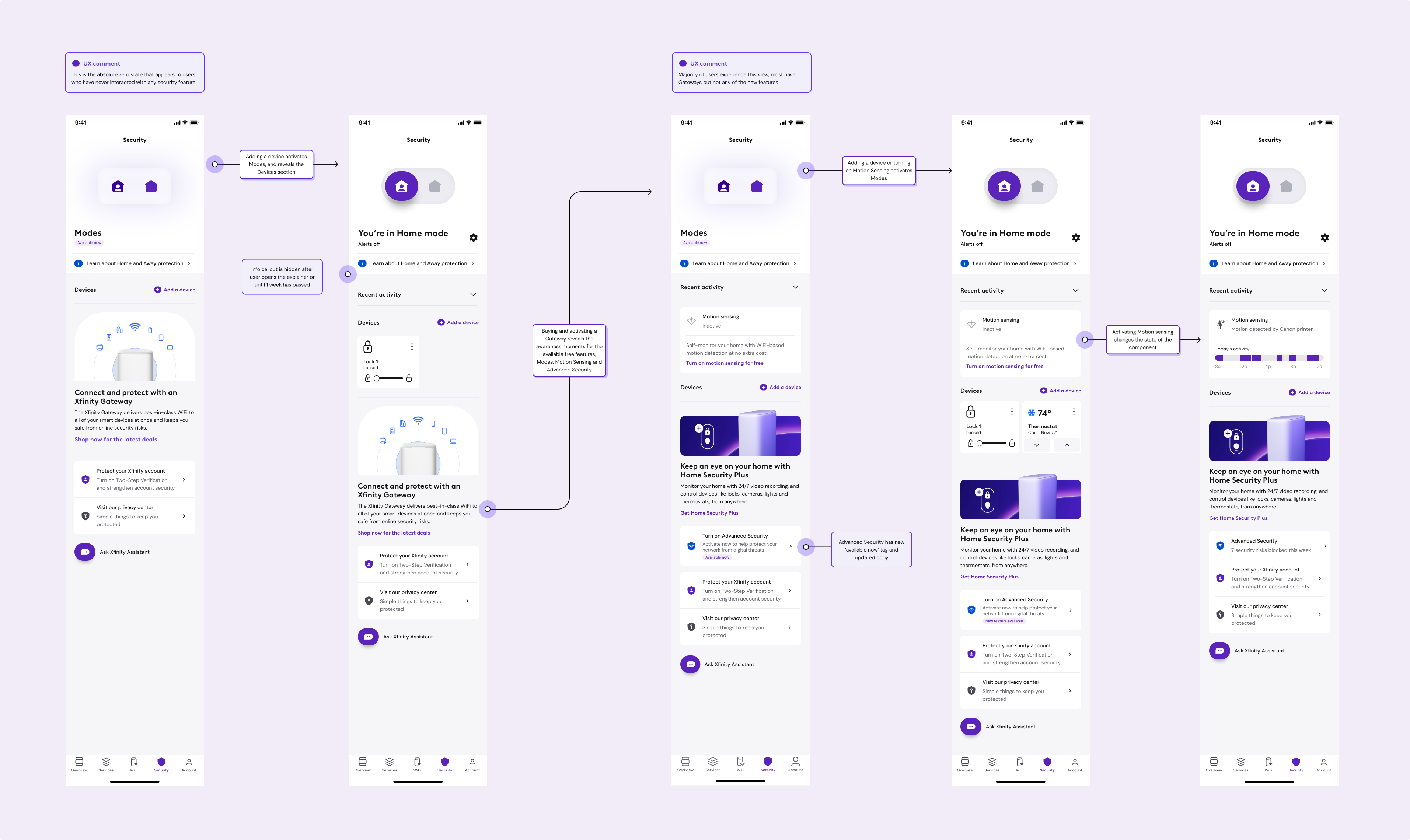
A predictable rhythm across features
Standardizing how features were prioritized on the surface gave users a predictablity across the entire experience, not just the Security tab.
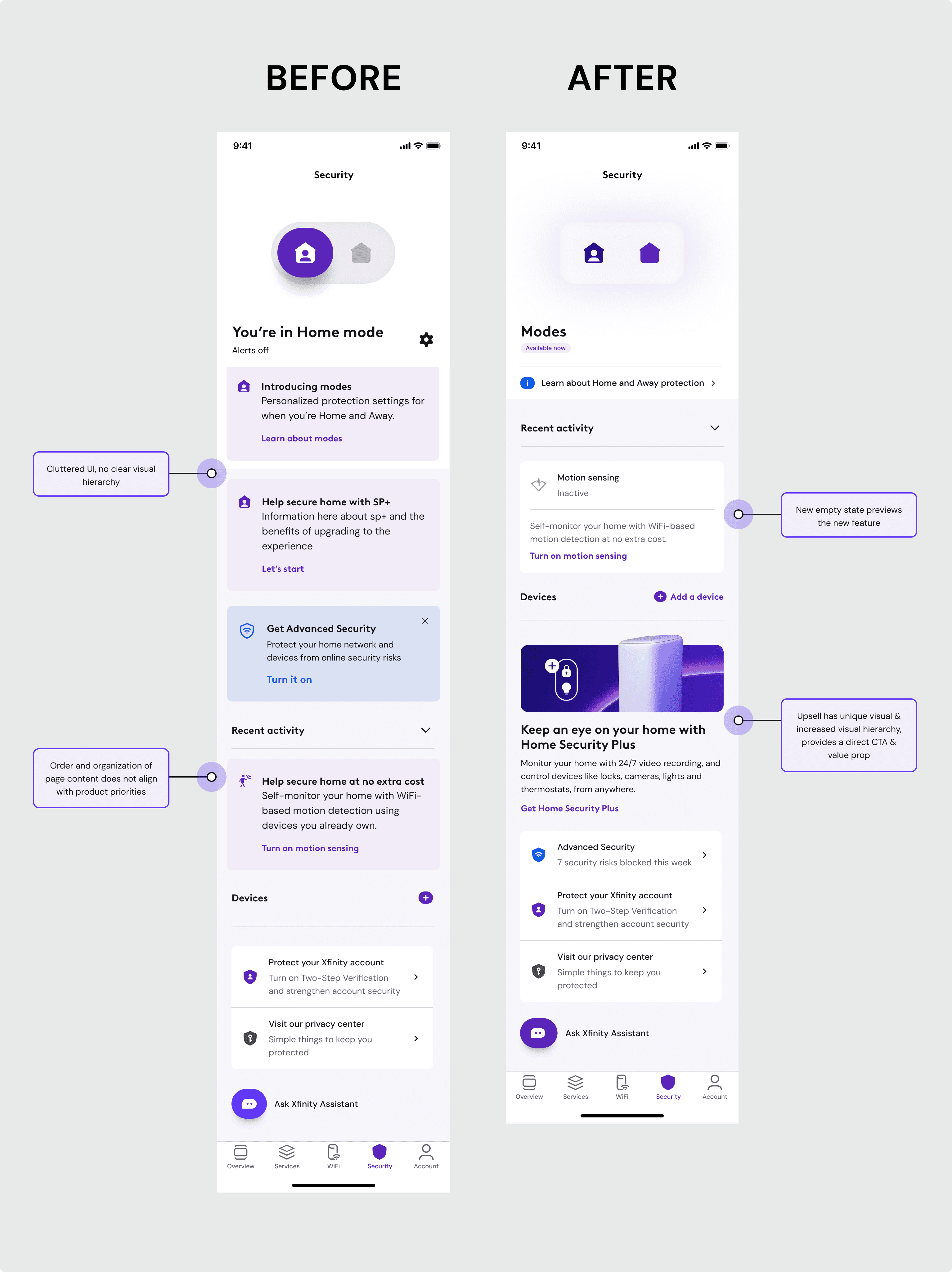
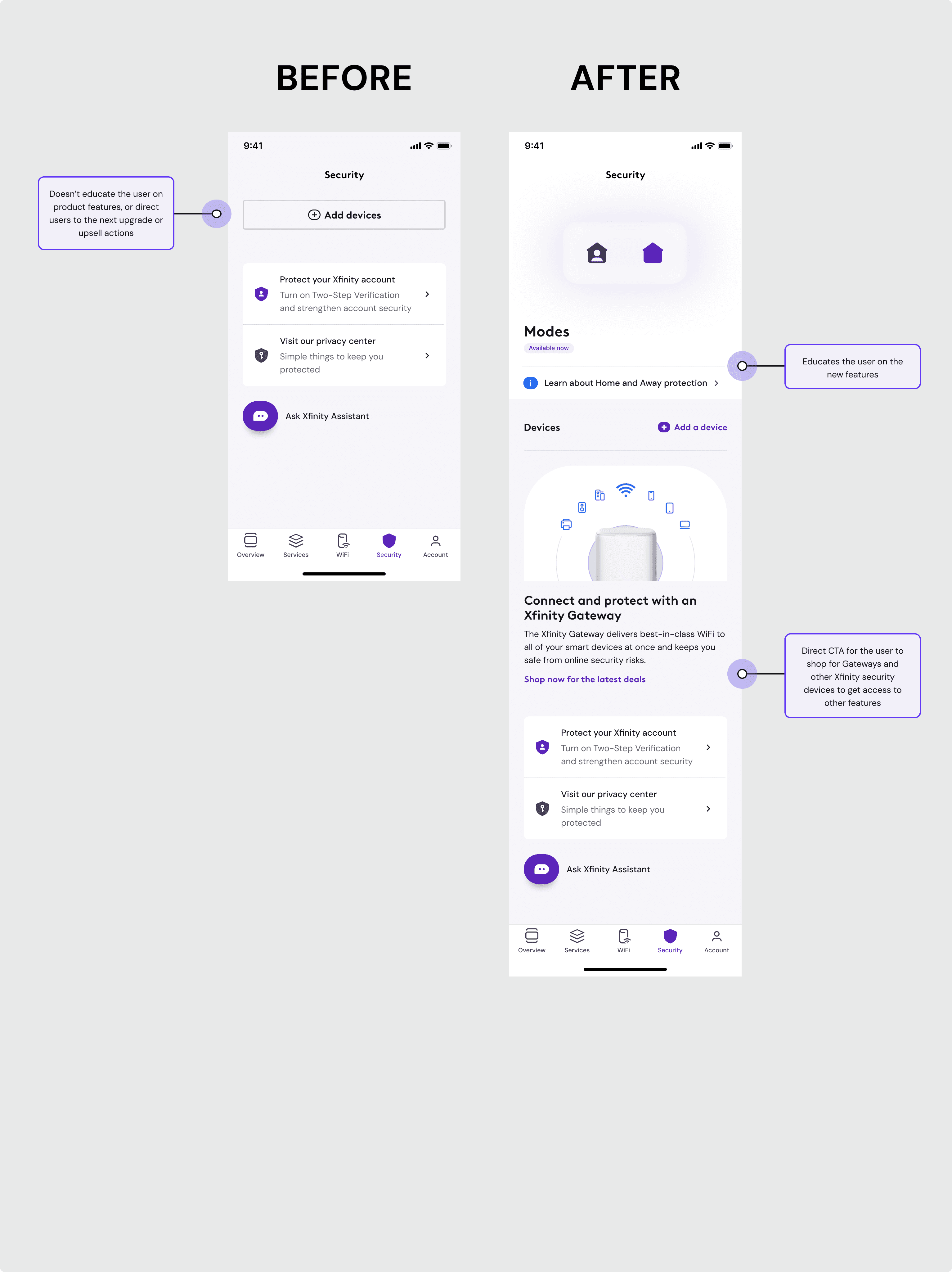
lift in feature activation in the first month. The reframe from feature-first to user-first turned a cluttered tab into a path customers actually moved through.
What I carry forward
The most valuable work happened upstream of any pixel. Pushing the team to agree on a shared model of the user paid off across every later ship, far beyond the page the brief originally asked about.
And it only landed because it was argued in business terms. Tying user-centered design directly to activation, engagement, and conversion made the framework a tool product kept using long after the project closed.