Scaling an enterprise design system from tool to product
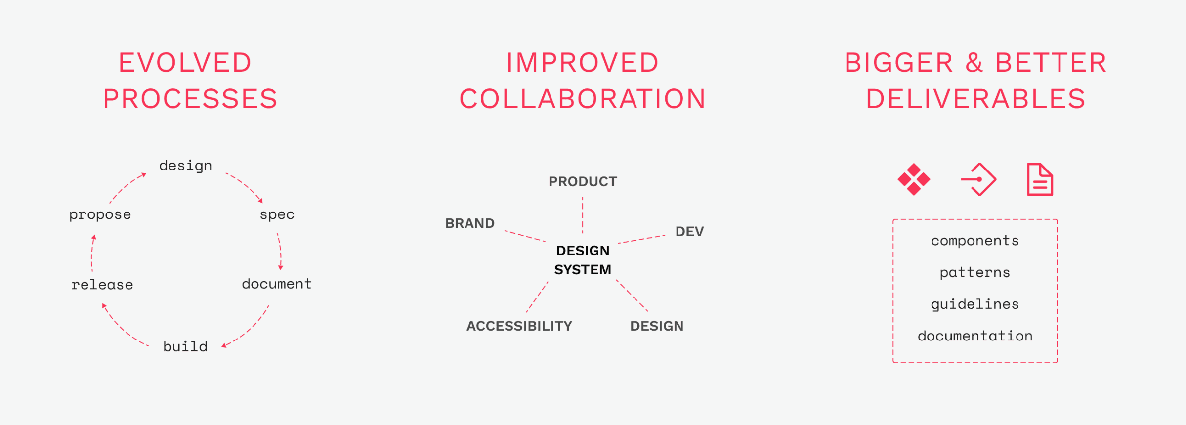
To evolve Vanguard's design system I implemented a new operating model that allowed us to work faster, tackle bigger challenges, and enabled designers and engineers across the org to deliver more consistent and usable experiences.
New internal processes
I built structure for our component delivery process by introducing a new model for communication, review, collaboration, and co-authoring.
Solving problems for adopters
I sped up the intake and delivery of new component and pattern requests to build trust, deliver value, and collaborate with our adopters.
Bridging design & engineering
Through frequent touchpoints and working sessions, we built new specification templates, taxonomy standards, API structure, and a culture of partnership.
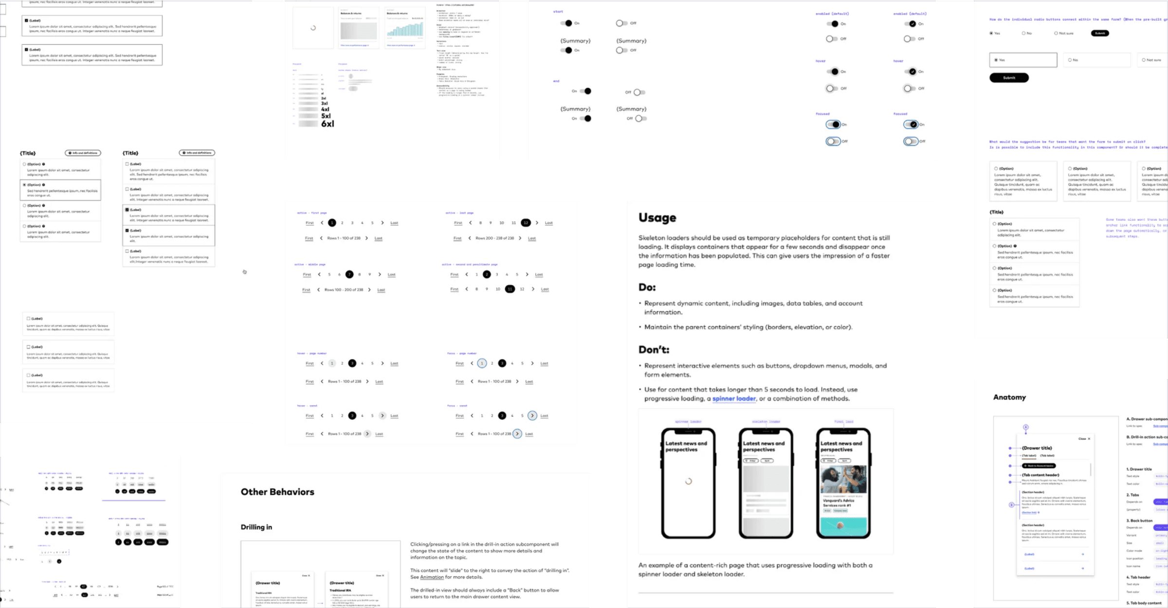
Our 1.0 library was an MVP; a handful of foundational components, basic styles, and ad-hoc processes. We struggled to tackle complex components or handle conflicting input from feature teams.
As a team we identified these goals for 2.0; scale the library, ensure consistent quality, close the design/dev gap, build the right features and components, and properly support the teams that needed them.
New components started with a proposal template capturing use cases, accessibility constraints, business value, and visual references, all co-owned by designers, engineers, and product partners.
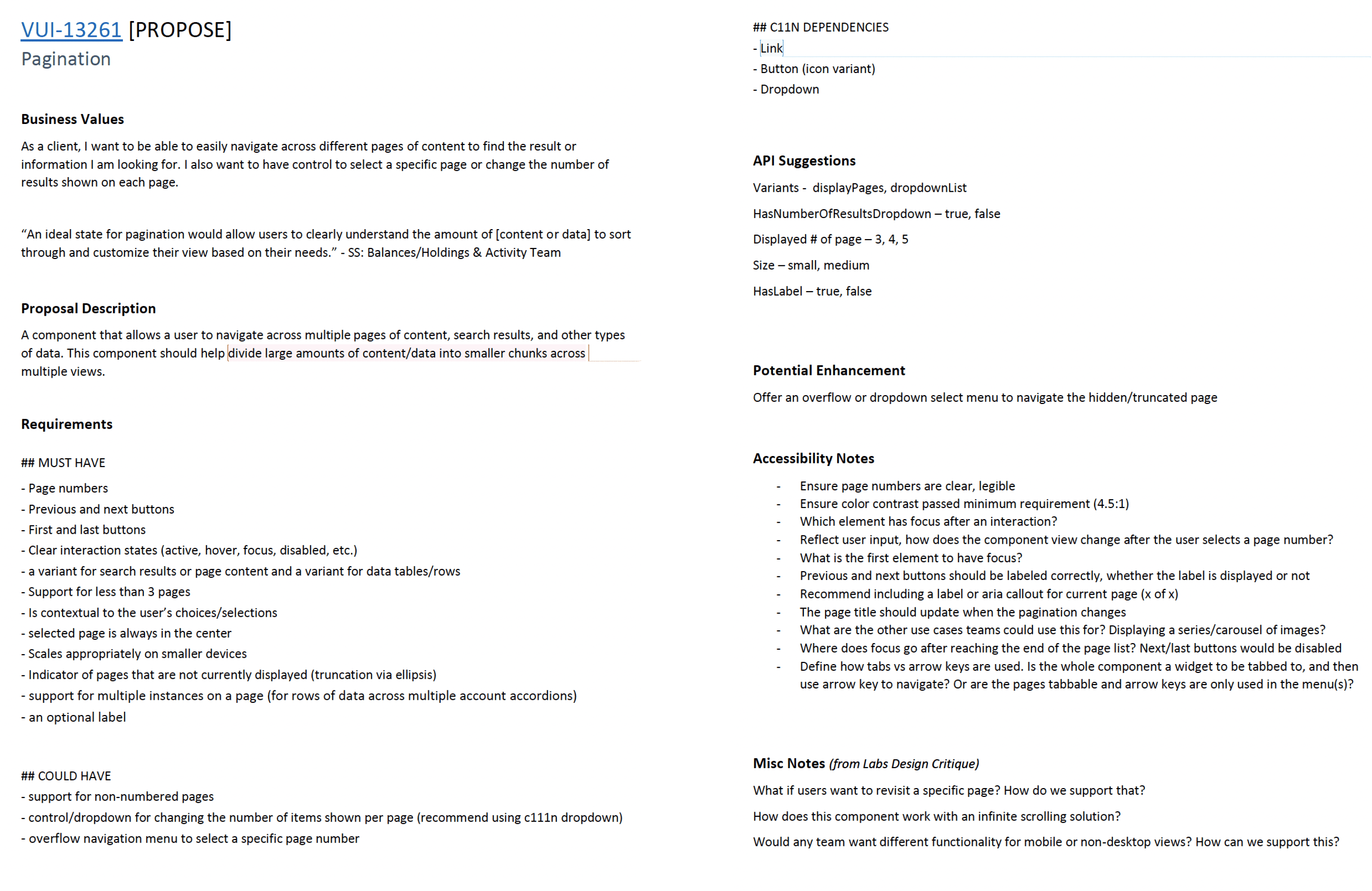
With requirements locked early, designers ran async check-ins and structured reviews. The proposal became the source of constraints, so the team moved faster inside clear boundaries.
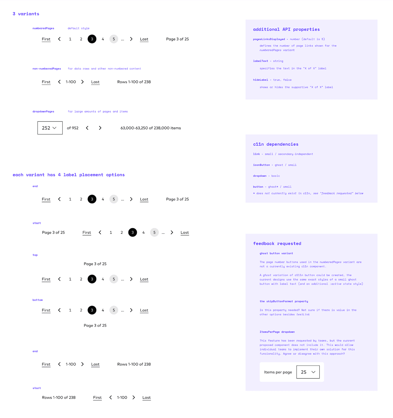
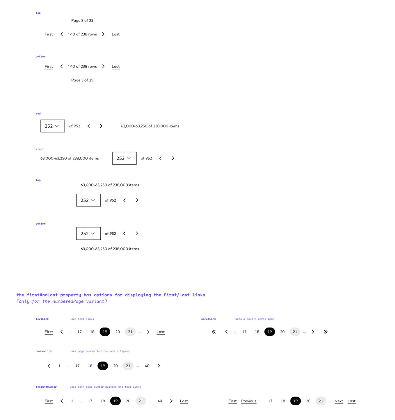
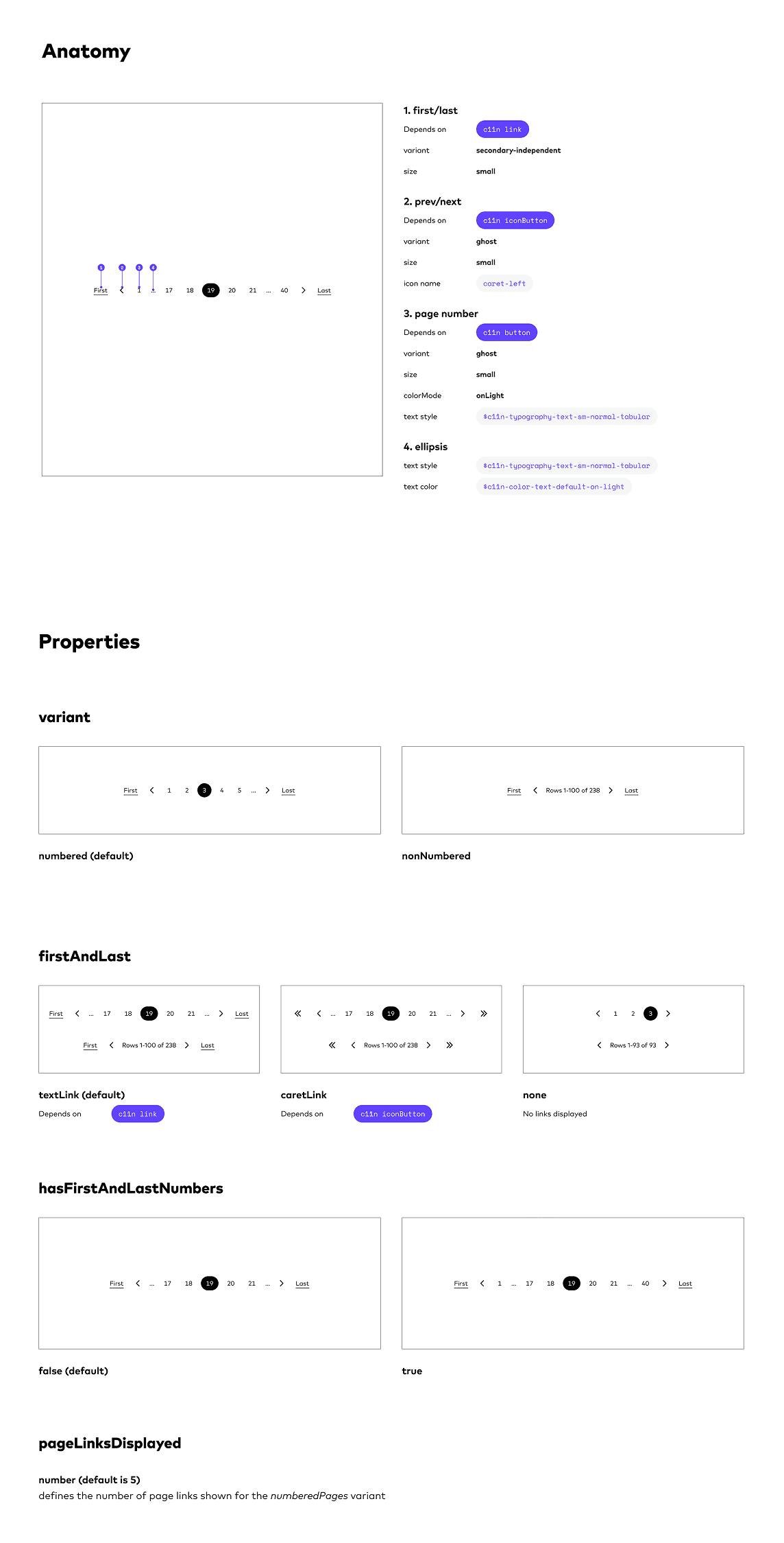
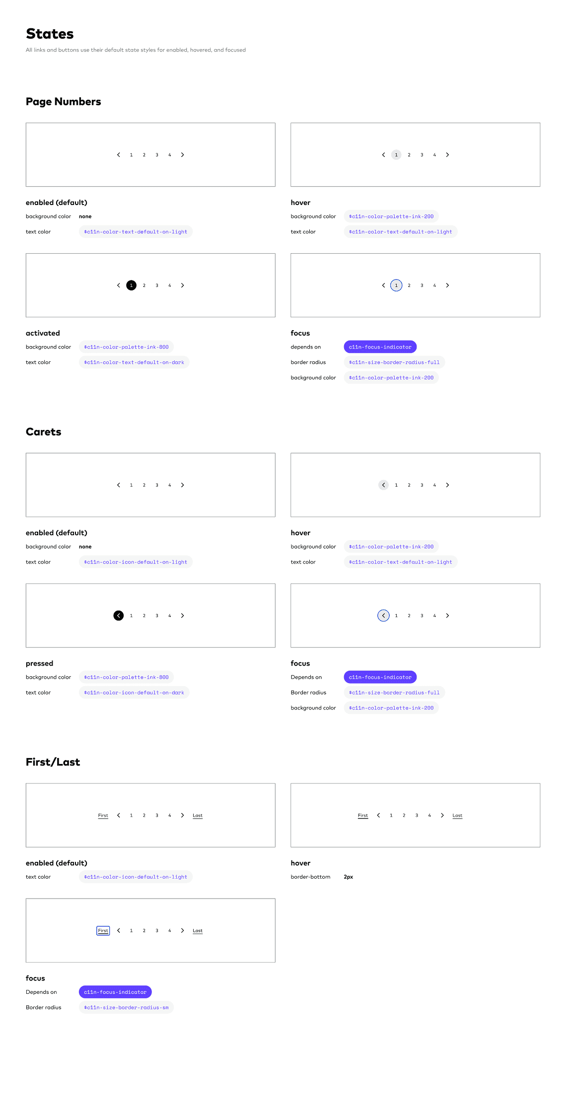
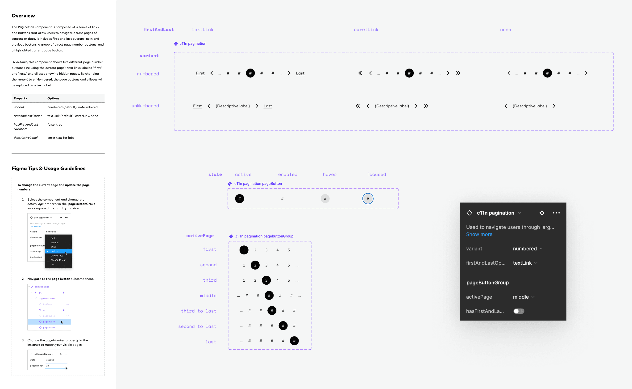
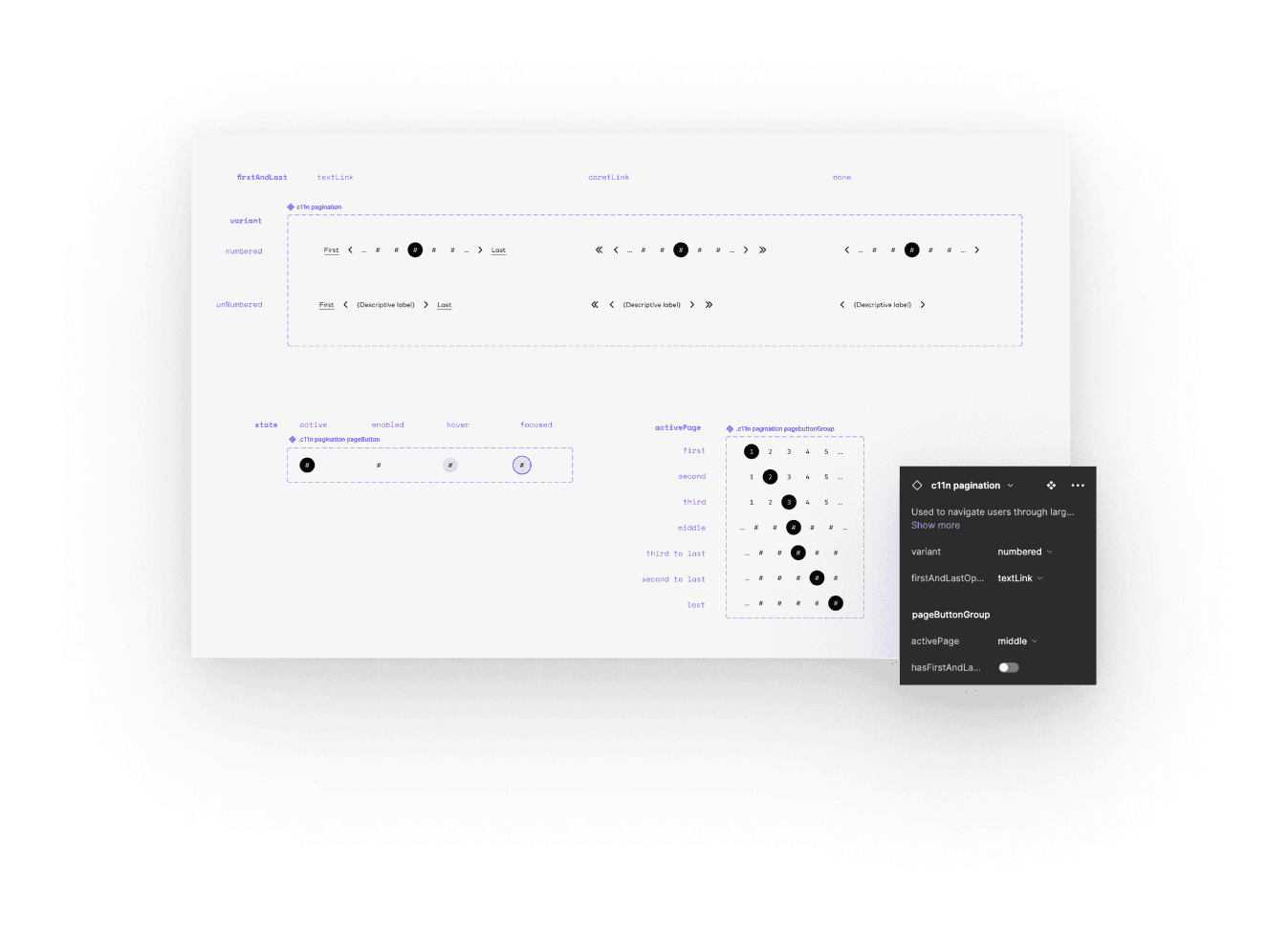
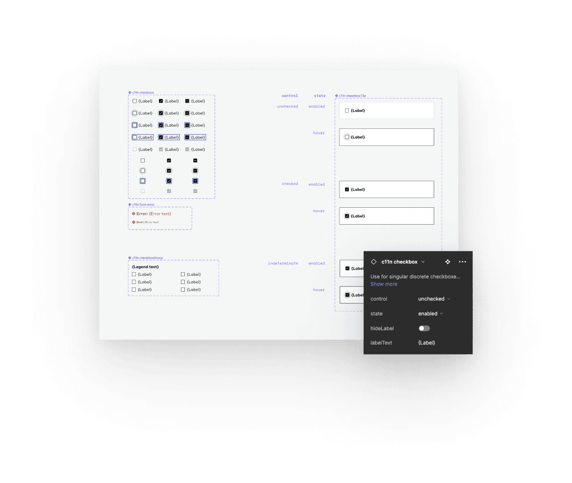
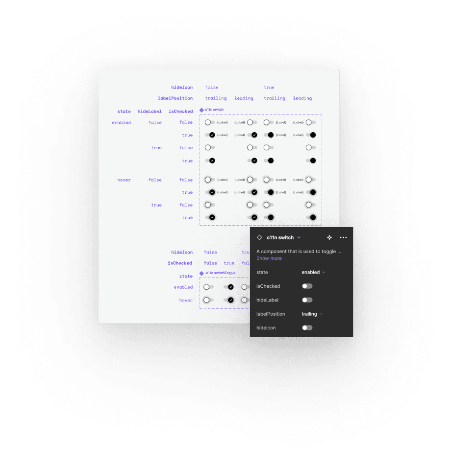
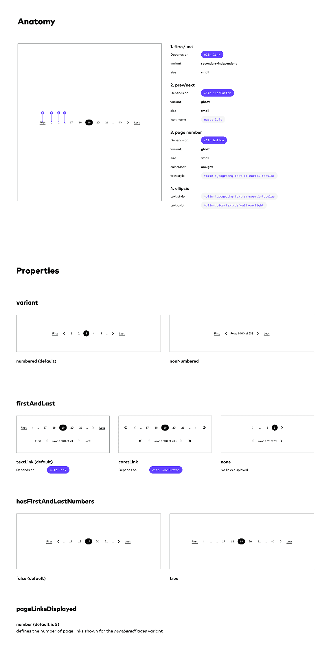
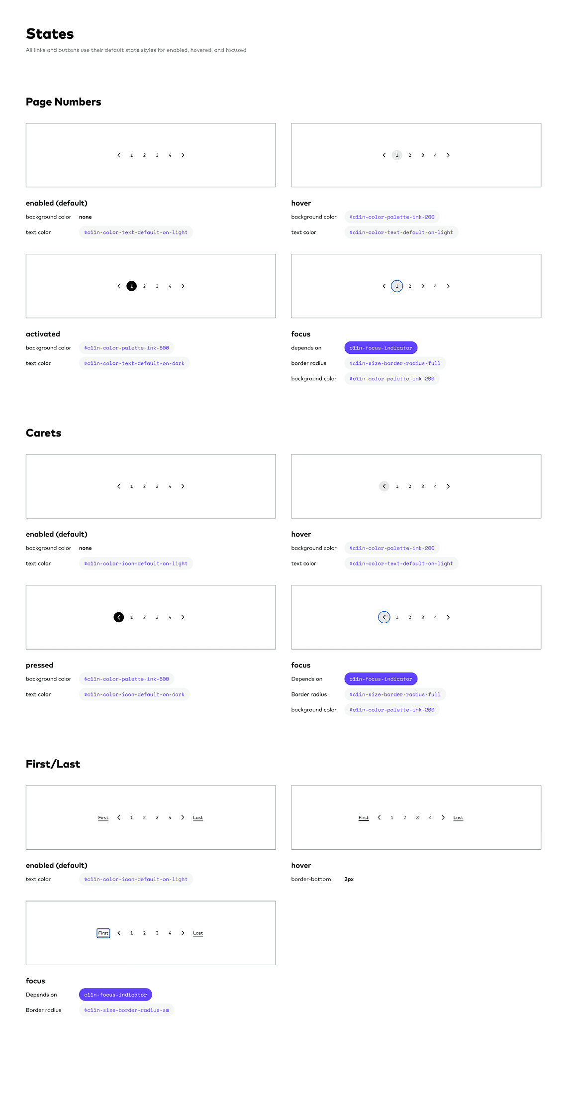
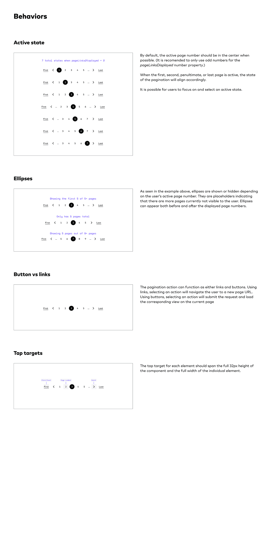
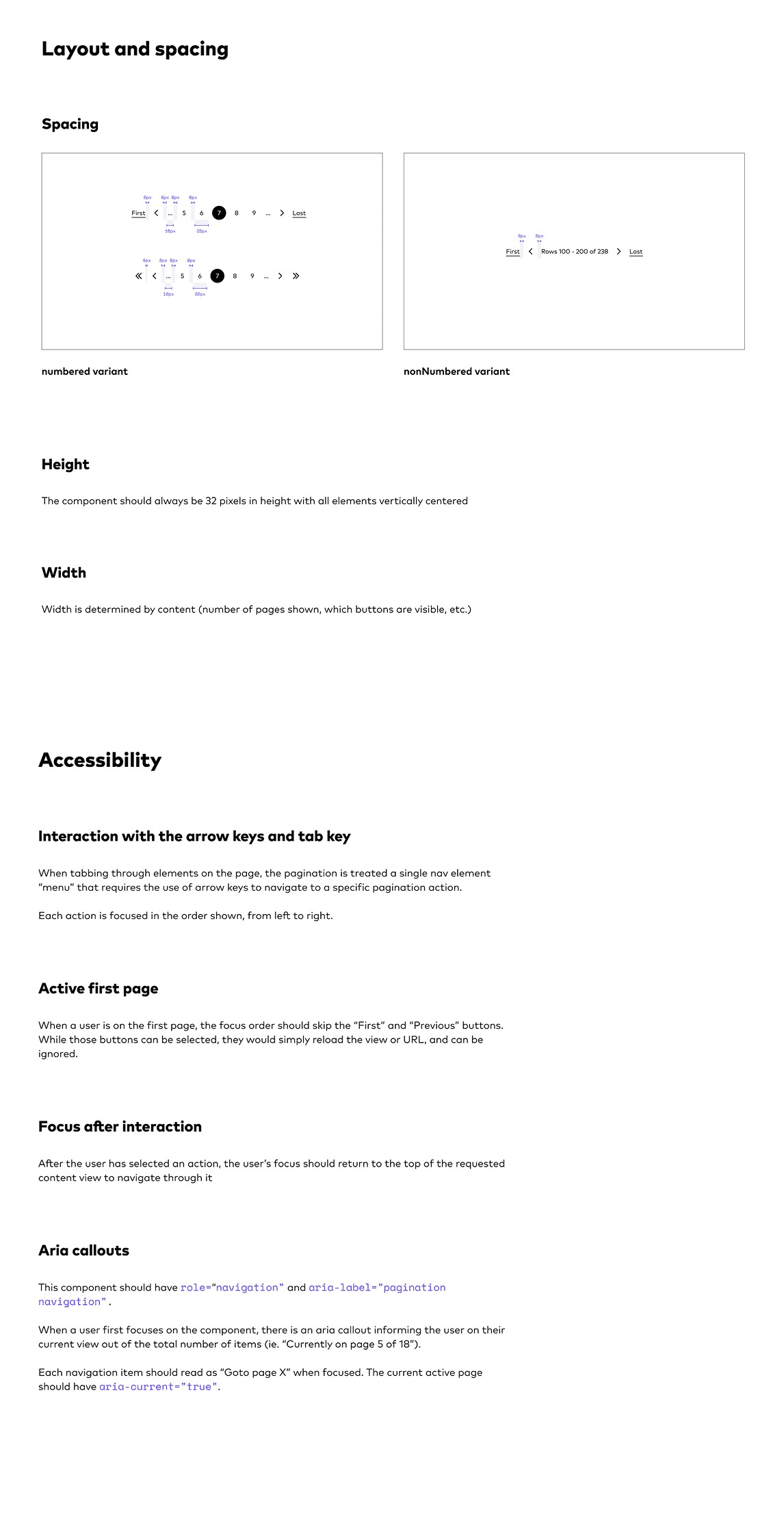
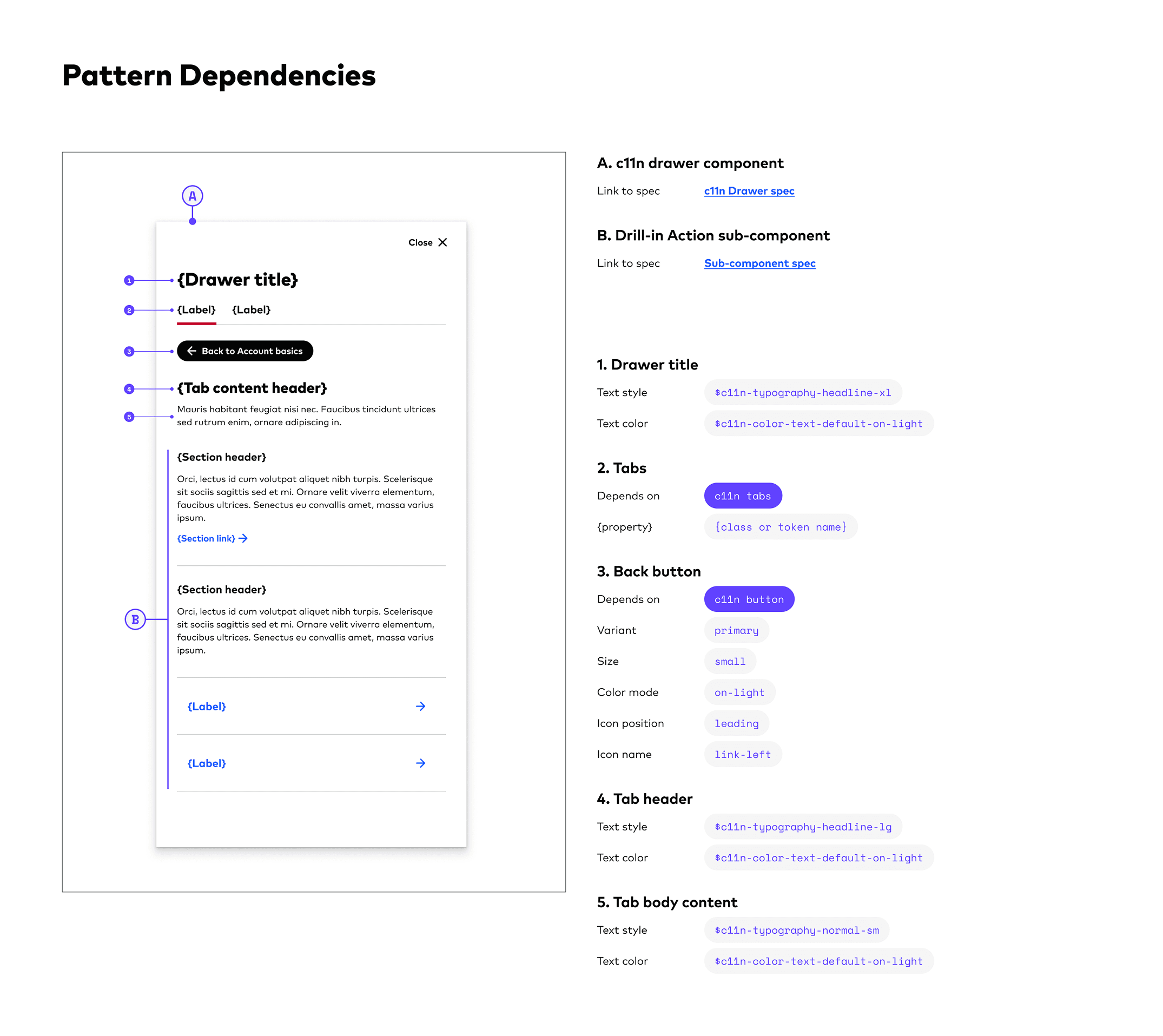
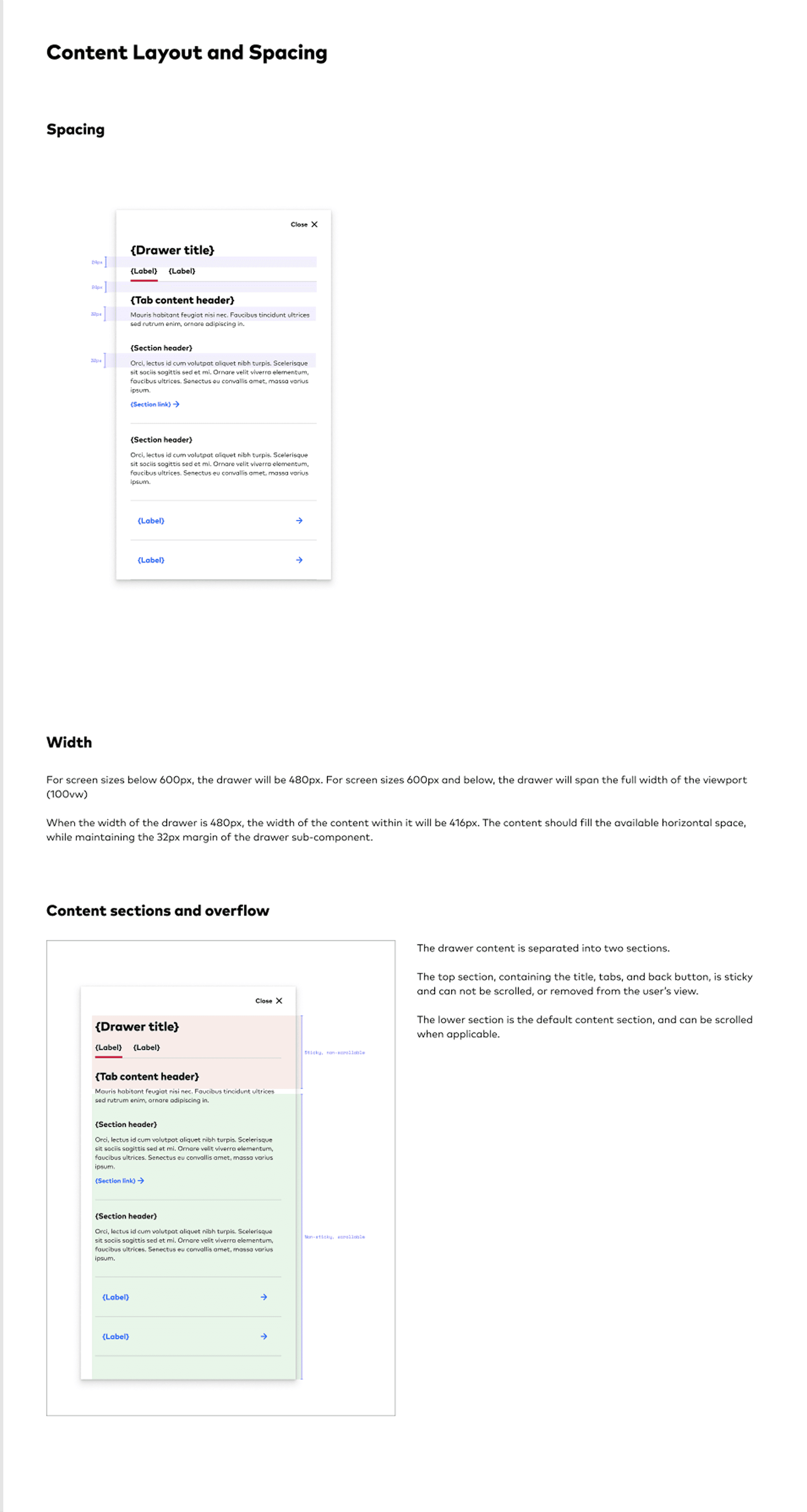
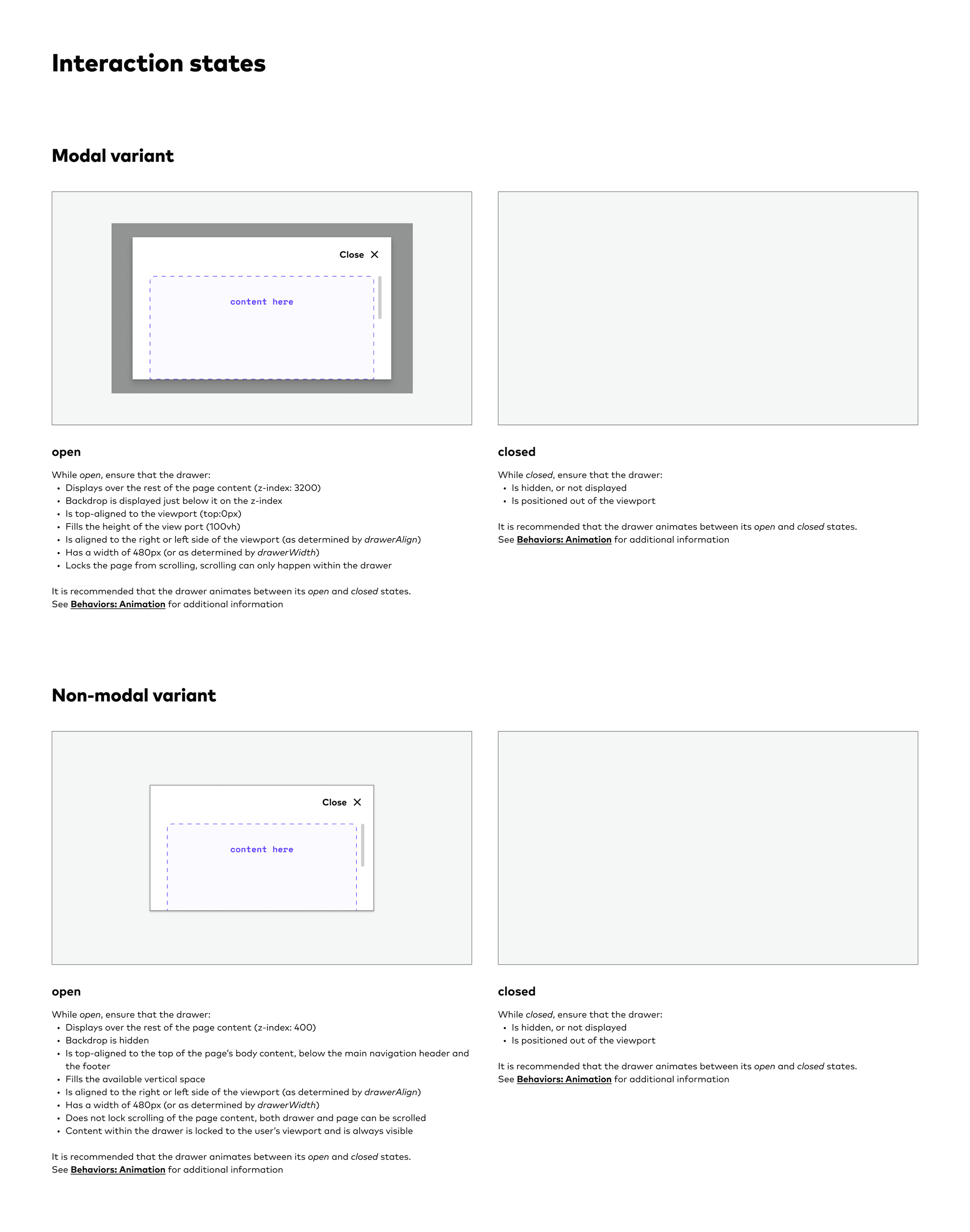
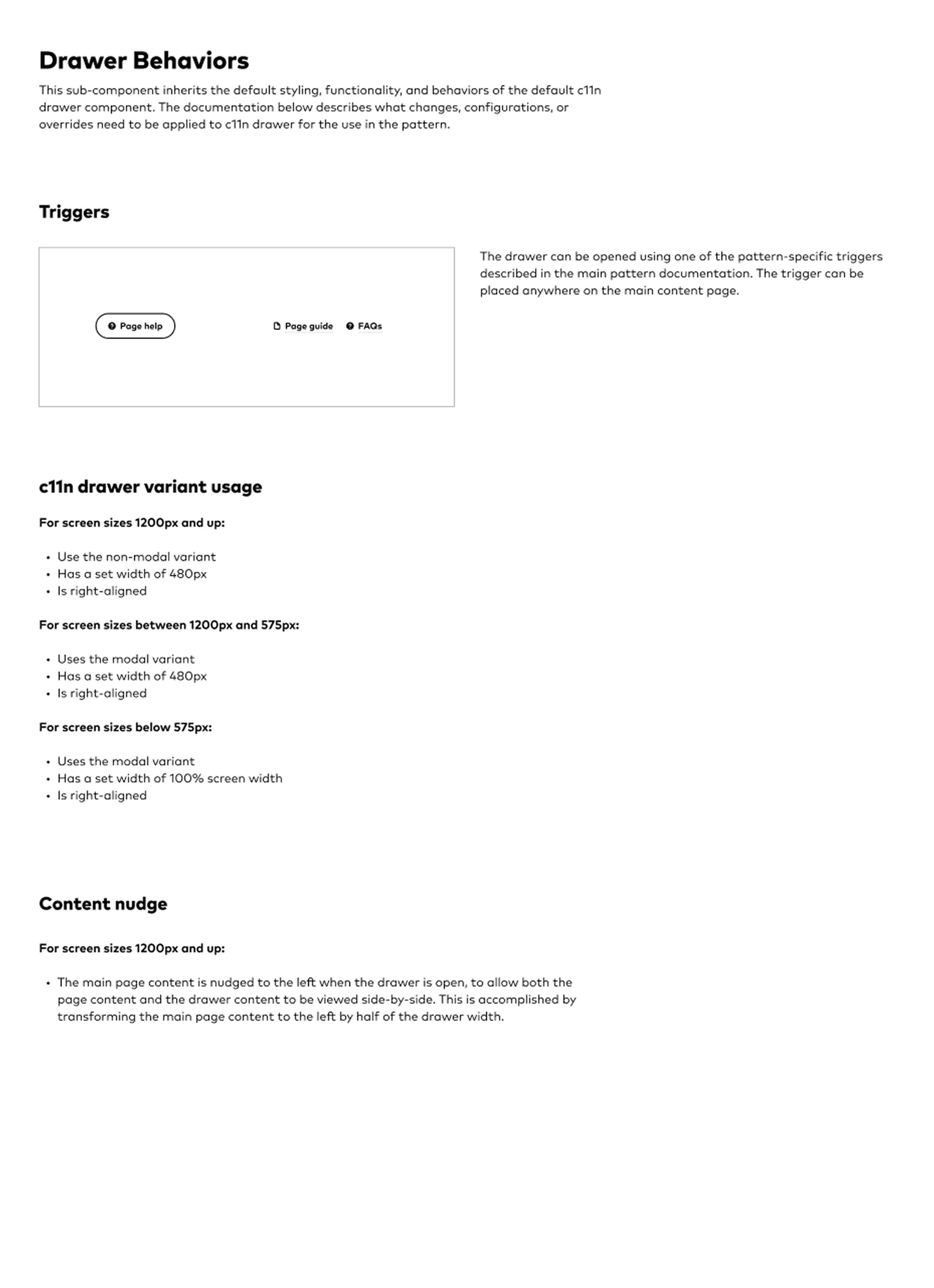
Spec sheets became the shared artifact between design and engineering, documenting states, properties, interactions, and tokens against a common API taxonomy.
Internal mentorship
Async check-ins and structured reviews replaced standing meetings, enabling smaller groups to collaborate and upskill.
Cross-team workshops
By partnering with our feature teams to gather requirements, understand constraints, and define use cases, we could build solutions based on real needs.
Bringing in industry experts
We worked with Nathan Curtis to develop our new spec template, which he later adapted into the now-popular Specs plugin.
Components shipped ready to adopt
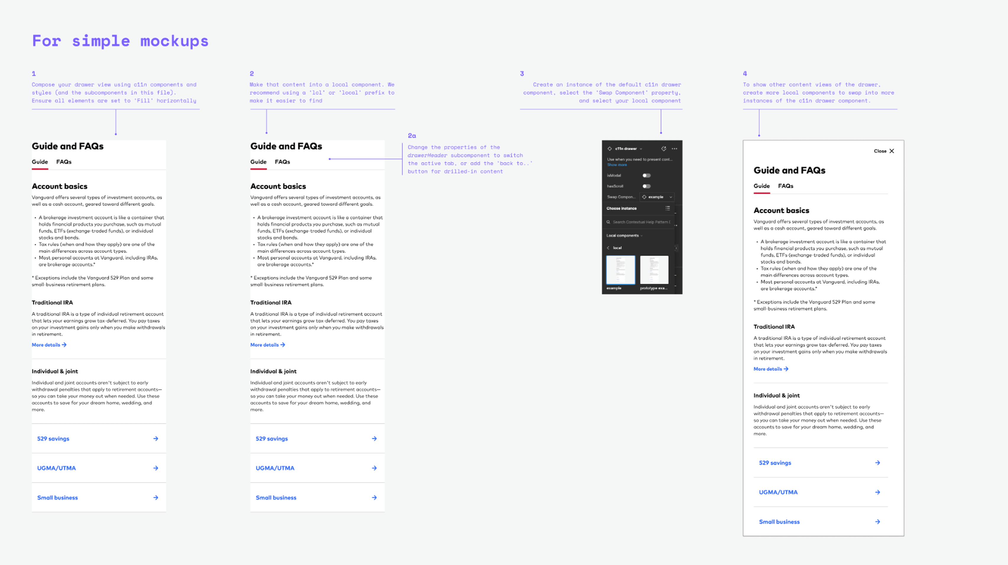
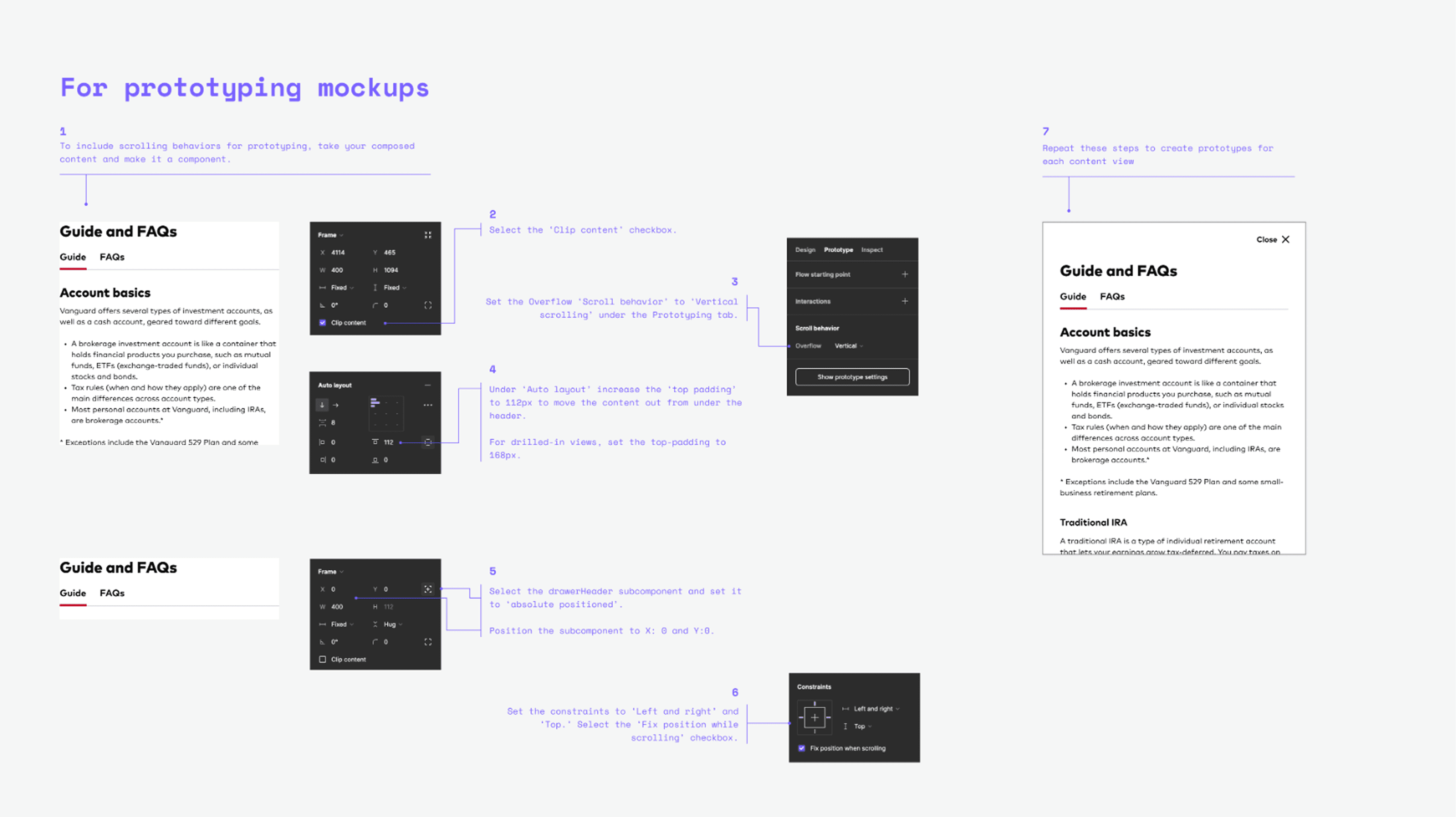
Every component was built in Figma to a production standard, with fully modeled variants and states, responsive behavior, and design tokens baked in, so teams could pull them straight into their work and trust they would hold up.
Specs built for a clean handoff
Each finalized component shipped with a working spec, anatomy breakdown, and accessibility notes, so engineers could implement without back-and-forth, and downstream designers could trust the source.
Patterns that compound across teams
Beyond individual components, we documented recurring patterns (composition rules, layout primitives, and content guidelines) so new product surfaces could assemble cohesive experiences without starting from zero.
growth in design-system adoption across product surfaces over two quarters. The system went from a nice-to-have to a tool teams reached for by default.
What I carry forward
What this project taught me was the value of communication, shared language, and shared truth. The hardest problems were rarely technical; they were about getting people to agree on what a component was and how it should behave. When designers and engineers shared one definition, the work stopped being a negotiation and started compounding. That is what I carry into every system I build now: a focus on co-ownership and sharing responsibilities across disciplines.