Keytruda
SUMMARY
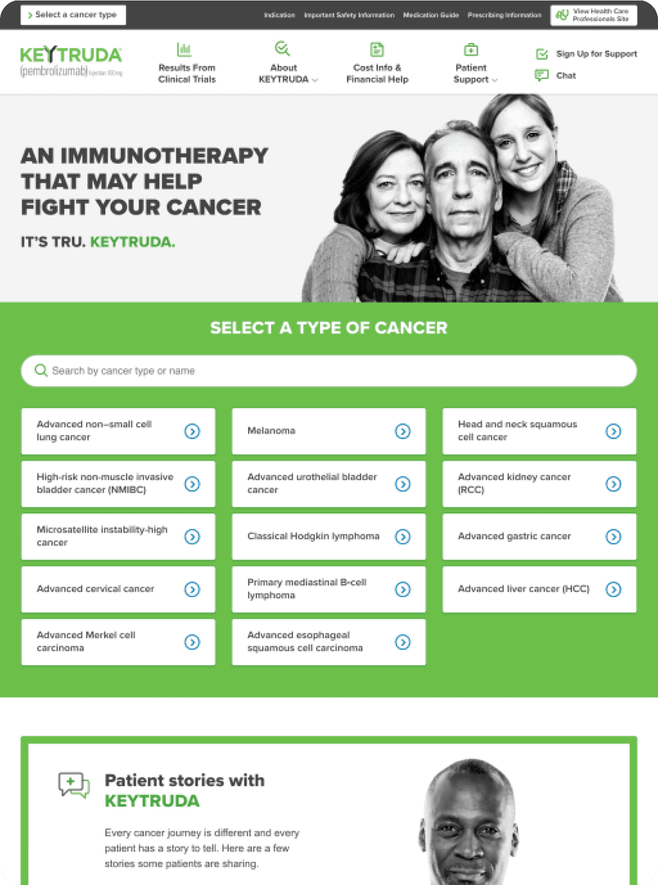
The previous Keytruda.com experience was not responsive nor accessible, had confusing navigation menus, and wasn’t built with future expansion in mind. The brand had quickly evolved since 2017, and needed a modern web experience to reflect the ever expanding list of indications and evolved branding.
As a Visual Designer on the team, I worked on creating the new UI design for the website, and the web style guide and component library supporting it. I worked with an art director, another designer, three UX experts, and multiple project managers, copywriters, and developers on this large-scale redesign and launch.
SUMMARY
The previous Keytruda.com experience was not responsive nor accessible, had confusing navigation menus, and wasn’t built with future expansion in mind. The brand had quickly evolved since 2017, and needed a modern web experience to reflect the ever expanding list of indications and evolved branding.
As a Visual Designer on the team, I worked on creating the new UI design for the website, and the web style guide and component library supporting it. I worked with an art director, another designer, three UX experts, and multiple project managers, copywriters, and developers on this large-scale redesign and launch.

CONTEXT
I had joined after preliminary UX research had been completed, early designs had been explored and a general look and feel had been approved by the client team. Our goals were to improve accessibility and navigation, while applying a more modern look-and-feel that matched the rest of our advertising visuals across print and video.
PROCESS
I first focused on updating and maintaining the web style guide, creating symbols and styles using the brand typeface, colors and visual elements. I established a naming convention, and created all of the necessary design tokens needed to align the print and web visual styles.
Leveraging Sketch, and it’s Symbol Library features, I then explored, designed and iterated on the UI components, working alongside a creative director, a copywriter, and a UX expert to ensure each element met the necessary standards and requirements from usability, accessibility, brand, and content.
These components included a set of extensively reworked and redesigning data visualization components, user-friendly global navigation, content callouts and CTAs, brand-infused page heroes, new visual structure for the legally-required safety information elements, and new UX-focused sign up forms & fields.

SOLUTIONS
Our system was based on Brad Frost’s Atomic Design, with the greatest focus on the base-level atoms, and larger-scope organisms (or components). This allowed for a high level of flexibility when creating and iterating new components, and clear rules and toolset when creating page designs and content.
Having a simple naming structure and consistent methodology made both decision-making, and communication with our developers and copywriters easier and more efficient while building out dozens of pages within short timeframes.
Significant focus was also given to flexibility and future-proofing our designs, allowing for new content to be built, expanded and improved in the future as both the website and brand grow.
In the end, the final system included a brand-new icon set, 20+ desktop and mobile page templates, and around two dozen finalized Sketch symbols for every component and element. Much of this work would also be organized and documented further in an Invision DSM project for internal reference and visibility.
This site was launched and is still live today at https://www.keytruda.com/.


